Our New Logo Is a Fibonacci Spiral. Here's Why
TL;DR
The new AgileKit logo is a Fibonacci spiral: four quarter-circles with radii 2, 3, 5 and 8, the same numbers your team votes with in planning poker. Each number is the sum of the two before it, the squares they make tile a rectangle that closes in on the golden ratio (about 1.618), and the arcs join into a single stroke. Even the colour is a formula: its red, green and blue are 1/φ², 1/φ³ and 1. We read the mark as agile: four iterations, each built on the last, turning without stopping and never closing.
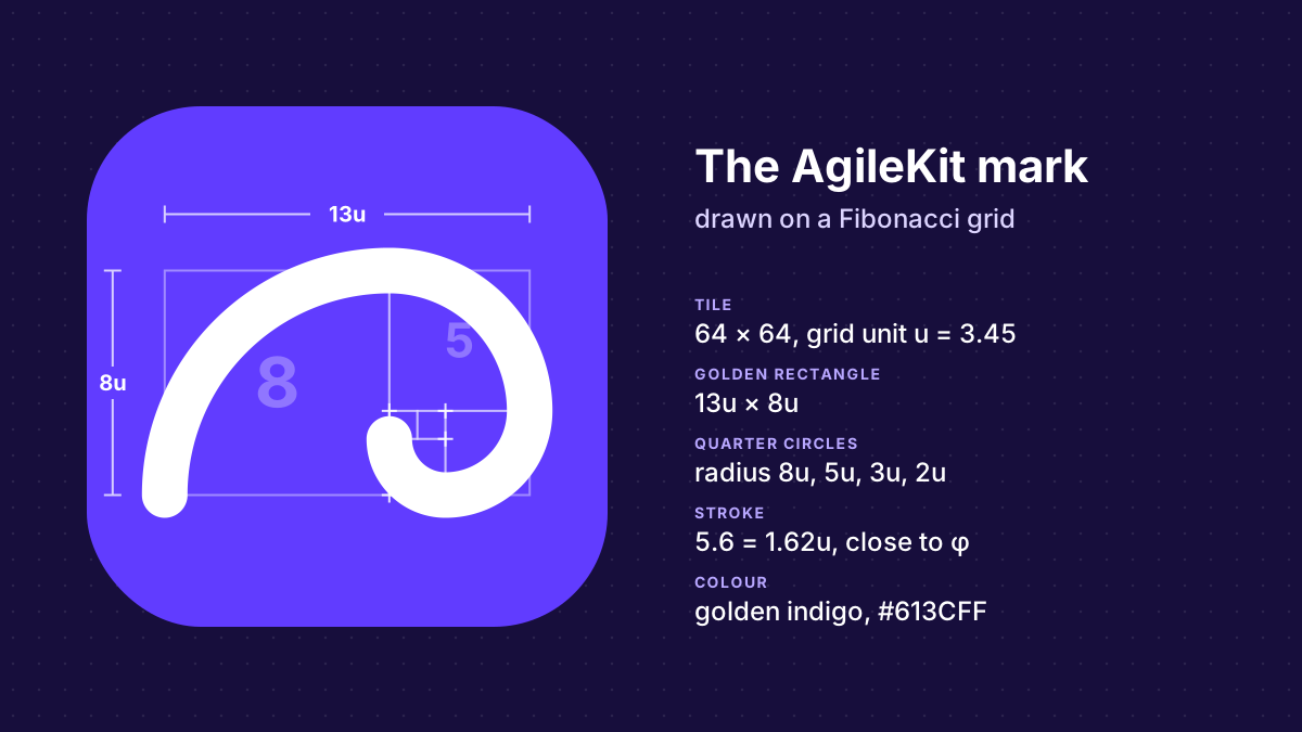
AgileKit has a new logo: one white stroke on an indigo square. It starts wide at the bottom left, sweeps over the top and curls in on itself. It’s a Fibonacci spiral, and nothing in it is drawn freehand: every curve comes from the numbers printed on a planning poker deck.
Why we replaced the old logo
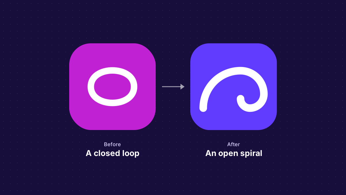
The old logo was a magenta square with a loop in it. The loop didn’t stand for anything, and it closed on itself, which is the opposite of how a team gets better.
AgileKit is also outgrowing its first job. It started as a planning poker tool, retrospectives followed, and more of the work of planning and building projects is on the way. A logo of a card or a sticky note would have tied the brand to one feature. We wanted a mark that says agile without naming a ceremony, that still reads as a 16-pixel favicon, and that we could explain. The explanation is the rest of this post.
Every square is the sum of the two before it
Start with AgileKit’s default deck: 0, 1, 2, 3, 5, 8, 13, 21, 34, 55, 89. After the first two cards, each number is the sum of the two before it: 1 + 1 = 2, 1 + 2 = 3, 2 + 3 = 5, 3 + 5 = 8. That’s the Fibonacci sequence, named after Leonardo of Pisa, who used it in 1202 to count rabbits. Indian mathematicians had written it down centuries earlier.
Planning poker uses the sequence because its gaps grow with the numbers, the way uncertainty grows with the size of the work. You can tell a 2 from a 3, but nobody can tell a 20 from a 21. Why planning poker uses the Fibonacci sequence covers that side of the story.
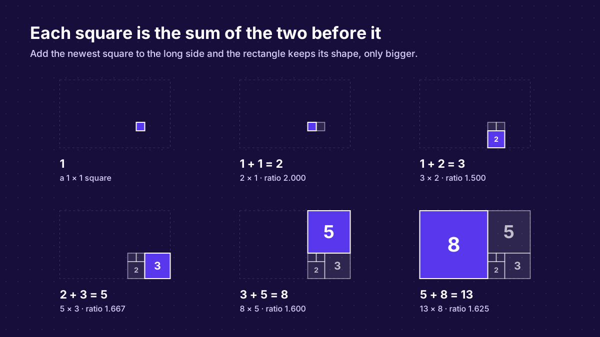
The logo uses the same numbers as geometry. Turn each number into a square with that side, and lay each new square along the long side of the shape so far. It always fits exactly, because its side is the sum of the two squares it rests against.
The rectangle closes in on the golden ratio
Every step leaves a rectangle whose sides are two neighbouring Fibonacci numbers. Divide the long side by the short one and watch where the answer goes:
| Rectangle | Long side ÷ short side |
|---|---|
| 2 × 1 | 2.000 |
| 3 × 2 | 1.500 |
| 5 × 3 | 1.667 |
| 8 × 5 | 1.600 |
| 13 × 8 | 1.625 |
| 21 × 13 | 1.615 |
| 89 × 55 | 1.6182 |
The ratio swings above and below one number and closes in on it: the golden ratio, φ = (1 + √5) ÷ 2, or about 1.6180. By the top of the deck, 89 ÷ 55, it’s within a hundredth of a percent.
A rectangle in the golden ratio has an unusual property. Cut a square off one end and what’s left is another golden rectangle, smaller and turned on its side, because φ − 1 = 1 ÷ φ. You can keep cutting forever and the shape never changes. Run it backwards and you get the build-up above: add a square, and you have the same shape, only bigger.
One quarter-circle in every square
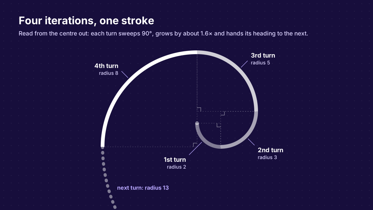
Now draw a quarter-circle across each square, from one corner to the opposite one, so its radius is the square’s side. Chain them from the largest square to the smallest. Each arc ends exactly where the next one starts, and both are heading the same way at that point, so the arcs join into one smooth line: a Fibonacci spiral.
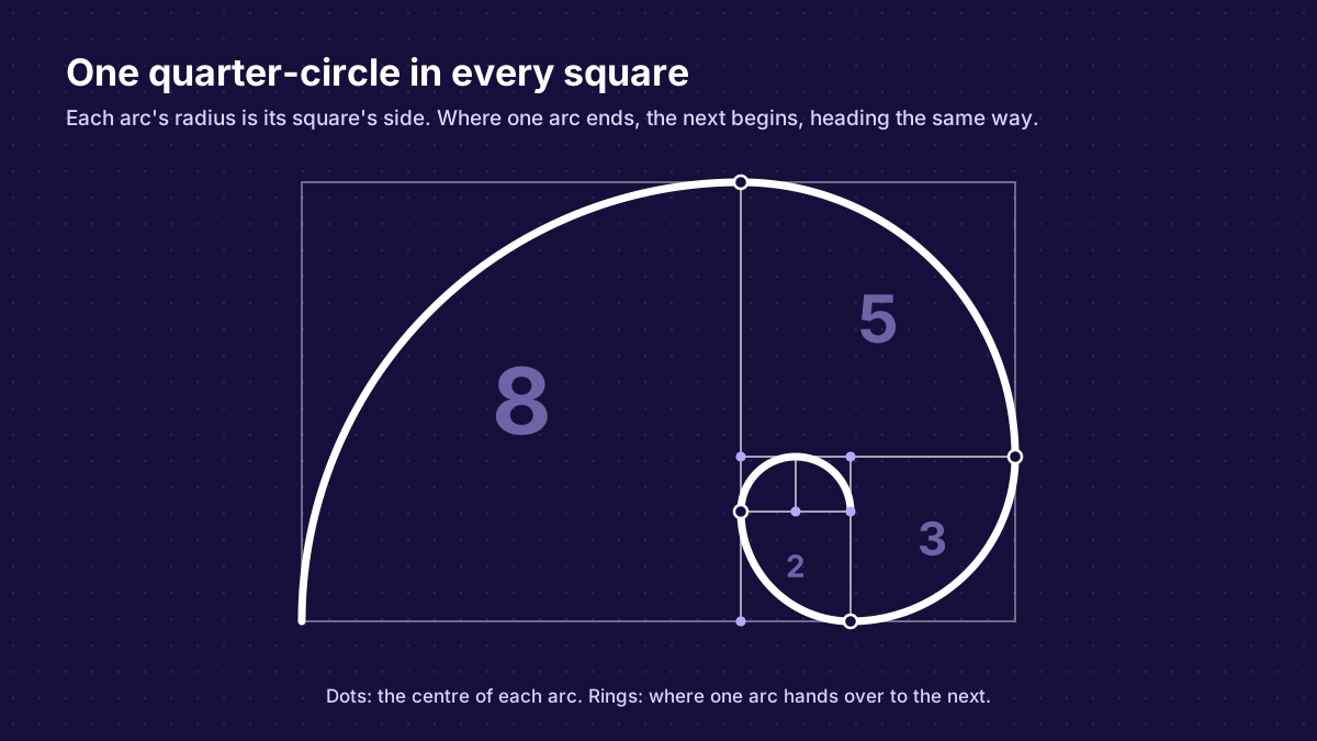
It’s the classic stand-in for the golden spiral, the curve that grows by exactly φ with every quarter turn. The Fibonacci version is simpler to build: four circular arcs, each with a whole-number radius on the grid.
How the logo is drawn
The mark is a 64 × 64 tile. Inside it sits the 13 × 8 rectangle, built on a grid unit, u, of 3.45, so the rectangle is 44.85 wide and 27.6 tall. It’s centred across the tile, and its centre sits 2 pixels below the tile’s, which balances the weight of the big arc at the top.
The stroke follows four of the quarter-circles, with radii of 8u, 5u, 3u and 2u: 27.6, 17.25, 10.35 and 6.9. That’s the whole drawing, one arc command per line:
<svg xmlns="http://www.w3.org/2000/svg" viewBox="0 0 64 64">
  <rect width="64" height="64" rx="14" fill="#613cff"/>
  <path d="M9.57 47.8
           A27.6 27.6 0 0 1 37.17 20.2
           A17.25 17.25 0 0 1 54.42 37.45
           A10.35 10.35 0 0 1 44.08 47.8
           A6.9 6.9 0 0 1 37.17 40.9"
        fill="none" stroke="#fff" stroke-width="5.6" stroke-linecap="round"/>
</svg>
Two decisions came from the smallest place the logo appears, a 16-pixel browser tab:
- It stops after four turns. The next arcs belong to the two 1-squares, and in a favicon their radius would be under a pixel. So the spiral ends at the 2-square, and the round end of the stroke stands in for the rest.
- The stroke is heavy. At 5.6, it’s 1.62 grid units wide. We picked it by eye, for the favicon, and only noticed afterwards that it’s φ again, to within a third of a percent.
Even the colour is made of φ
The indigo isn’t picked from a palette either. Its red, green and blue channels are powers of the golden ratio:
φ = (1 + √5) / 2 ≈ 1.618

Golden indigo        RGB = (1/φ², 1/φ³, 1)     = (0.382, 0.236, 1.000)  →  #613CFF
Deep golden indigo   RGB = (1/φ³, 1/φ⁴, 1/φ)   = (0.236, 0.146, 0.618)  →  #3C259E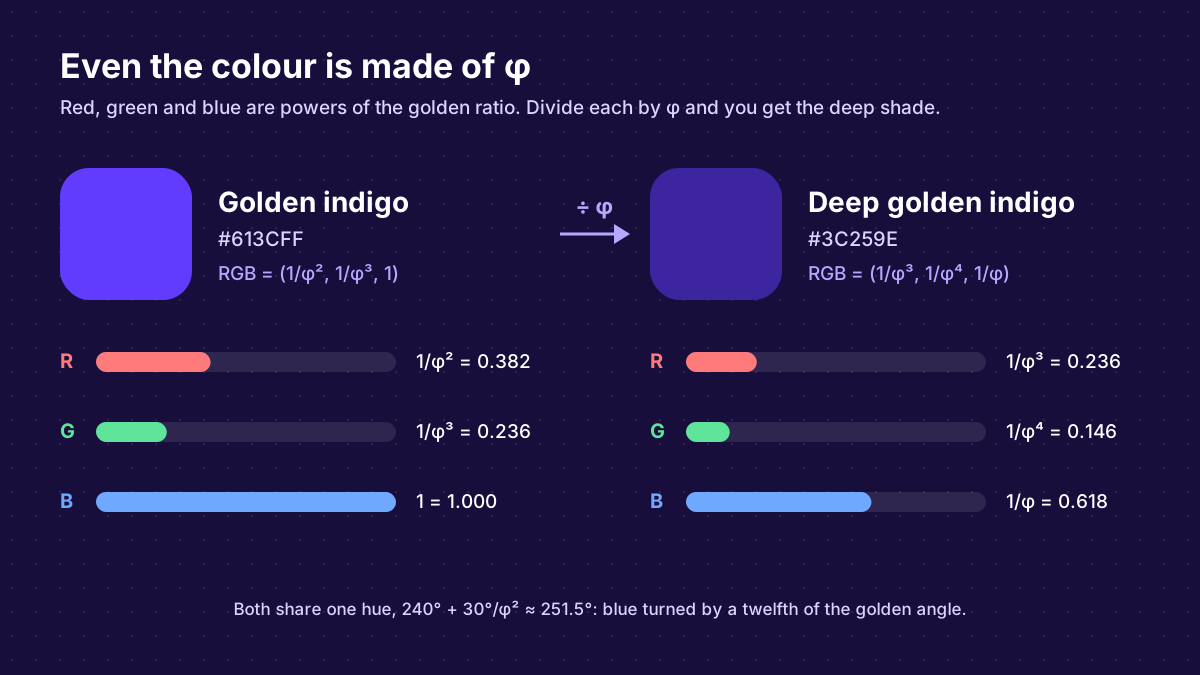
The recipe starts from the golden ratio’s own cut. Divide a line in the golden ratio and the two pieces are 1/φ ≈ 0.618 and 1/φ² ≈ 0.382 of it. Use those as a colour’s saturation and lightness, and every hue gives a colour whose strongest channel is 1/φ and weakest is 1/φ⁴. The middle channel is usually an awkward number. Turn the hue to 240° + 30°/φ², about 251.5°, and it lands on 1/φ³, so all three channels are powers of φ. That hue is pure blue turned by a twelfth of the golden angle, between blue at 240° and violet at 270°: right where indigo sits on the colour wheel. Between those two, it’s the only hue where this happens.
That’s the deep shade. Multiply each channel by φ and the hue stays put while the colour brightens: that’s golden indigo, the logo’s tile. White on it has a contrast ratio of 5.8:1, and the tile still stands out on a dark page. The deep shade has a ratio of 10.8:1 with white, which makes it the one for text on light backgrounds.
What the spiral says about agile
It iterates
Read the mark from the centre out. Each quarter-circle is one turn: it sweeps exactly 90°, then hands over to the next. Four turns, four iterations, one stroke. Barry Boehm drew software development as a spiral back in 1986, each loop a cycle of planning, building and review that ends wider than it began.1 Agile methods grew out of the same idea of working in loops. Scrum teams call them sprints.
Each turn is built on the last
Every radius is the sum of the two before it. Nothing gets thrown away: each turn is made of what the previous two delivered. That’s incremental delivery, drawn as a curve.
It changes direction without stopping
Every turn sends the line 90° in a new direction, but there are no corners. Where two arcs meet, they share a tangent, so the line keeps moving while it turns. Agile comes from the Latin agilis, nimble, from agere, to do or to move.2 Changing course without losing momentum is close to what the word meant from the start.
How sharply a curve turns is its curvature, one divided by its radius. The first turn, radius 2, turns four times as sharply as the last, radius 8. The smallest iterations are where a team can change course fastest.
It grows at a steady pace
From one turn to the next, the radius grows by 1.5, then 1.67, then 1.6: about φ every time. A spiral that grows by the same ratio every turn can keep going without changing shape. The Agile Manifesto asks the same of a team: to be able to “maintain a constant pace indefinitely”.3
It never closes
The old loop closed on itself. The spiral is open at its outer end, right where a fifth turn, radius 13, would begin. There’s always a next iteration.
What comes next
Planning poker and retrospectives were AgileKit’s first two turns. More are coming for teams that plan and build projects together, and the logo should still fit when they arrive, because it isn’t a picture of any one of them.
Run your next planning poker session with the numbers the logo is drawn from. Free, and nobody needs an account.
Frequently asked questions
Is the logo a true golden spiral?
No. A true golden spiral grows by exactly φ every quarter turn, and its curvature changes smoothly. The logo is a Fibonacci spiral, built from quarter-circles with radii 2, 3, 5 and 8, so it grows by 1.5 to 1.67 per turn and closes in on φ as the numbers grow. It’s the classic way to draw the golden spiral with a compass.
Why does planning poker use Fibonacci numbers?
The gaps between the numbers grow as the numbers grow, which matches how uncertainty grows with the size of the work. You can tell a 3 from a 5, but nobody can tell a 20 from a 21. Read more in Why Planning Poker Uses the Fibonacci Sequence.
Why does the spiral stop after four turns?
The next turns would use the two 1-squares. When the logo is shown as a 16-pixel favicon, their arcs would have a radius under a pixel. Ending at the 2-square keeps the mark legible at every size it’s used.
Where does the colour come from?
It’s golden indigo, #613CFF: its red, green and blue channels are 1/φ², 1/φ³ and 1. White on it has a contrast ratio of 5.8:1, so the stroke stays crisp even when the mark is small, and the tile still stands out on dark pages.
AgileKit is open source, logo included: the mark is one small SVG file in the repository.
Footnotes
-
Boehm, B. W. (1988). A Spiral Model of Software Development and Enhancement. Computer, 21(5), 61–72. First described in 1986. https://doi.org/10.1109/2.59 ↩
-
Wiktionary: agile. https://en.wiktionary.org/wiki/agile ↩
-
Principles behind the Agile Manifesto. https://agilemanifesto.org/principles.html ↩
Related Articles
Why Planning Poker Uses the Fibonacci Sequence (And Why It Works)
The Fibonacci sequence isn't agile tradition or arbitrary convention. It's built on how human perception actually works. Here's the science behind why 1, 2, 3, 5, 8, 13 makes your estimates better.
January 11, 2025
Jira Integration Is Here: Import Issues, Push Estimates, Stay in Sync
AgileKit now connects to Jira Cloud. Pull sprint issues into your planning sessions, push story point estimates back when your team agrees on a number, and stop copy-pasting between tabs.
February 27, 2026
Which Agile Estimation Technique Should You Use? 7 Methods Compared
Compare Planning Poker, T-Shirt Sizing, Affinity Estimation, and more. Find which method fits your team size, precision needs, and context.
January 27, 2025